


A bride researching planners does not read your website the way you would hope. She skims it the way she would skim a stranger’s wedding album—fast, visual, and half-decided within the first few moments whether this person understands the wedding she is picturing.
That is the real job of a wedding planner website template: to make her feel, before she studies every word of copy, that you already understand the day she has not fully described yet.
Most planner websites do not fail at this because the planner lacks taste. Her portfolio may be beautiful. Her timelines may be meticulous. Her client experience may be the reason three mothers of the bride still send her Christmas cards.
The problem is often the structure underneath the work.
Many wedding planner websites begin with a general portfolio template and receive wedding language afterward. The photographs change, the services are added, and the color palette becomes softer—but the page still behaves like it was built to display work rather than help a bride trust the person responsible for creating it.
A beautiful website can show what happened.
A strategic wedding planner website helps a bride imagine what will happen when she hires you.
A Wedding Planner Website Is Selling the Months Before the Wedding
A photographer can lead with the finished images because those images are the product. A planner’s photographs matter too, but they are evidence of something much larger: the decisions, conversations, vendor coordination, problem-solving, and careful management that happened long before the tables were set.
Your prospective client is not only asking, “Do I like these weddings?”
She is also asking:
Will this person understand what matters to me?
Will she guide me without taking over?
Will she catch the details I do not know to look for?
Will I feel calmer once she is involved?
Those questions are rarely typed into Google, but they are present on every page she visits.
That is why a wedding planner website template needs more than a striking gallery and an elegant services section. It needs enough room to show the experience behind the imagery.
A process section matters because a bride is trying to picture the months between signing the contract and walking down the aisle. An about section matters because she wants to know who will be in the room during emotional conversations and complicated decisions. Testimonials matter because she wants proof that someone else has already handed you a meaningful day and felt relieved that she did.
The website should not simply say that you plan weddings.
It should make the planning experience feel understandable before the inquiry begins.
What Makes a Website Feel Romantic and Editorial?
“Romantic editorial” can easily become one of those phrases everyone uses and no one explains. In practical terms, it describes a balance between emotion and restraint.
Romantic design brings warmth. You may see softer typography, graceful movement, layered imagery, organic details, or a color palette that feels inviting rather than severe.
Editorial design brings control. It uses strong hierarchy, intentional image placement, generous white space, and a page rhythm that feels curated rather than crowded.
Wedding planners need both.
A site that feels romantic without structure can become overly decorative. A site that feels editorial without warmth can look beautiful but emotionally unavailable—which is not ideal when your service involves family dynamics, meaningful traditions, and at least one unexpected seating-chart development.
The strongest editorial website design for wedding planners lets the work create feeling while the structure creates trust.
That might look like one large ceremony photograph instead of nine competing thumbnails. It may mean placing a short explanation of your process beside an image of the final reception rather than asking the photograph to explain twelve months of work by itself.
It also means giving every section a job.
The gallery creates desire.
The process creates reassurance.
The testimonials reduce uncertainty.
The services clarify fit.
The inquiry button gives the visitor one clear next step.
When all five are doing their own work, the site feels calm. Nothing is shouting. Nothing is missing. Your inquiry button is no longer responsible for holding the entire relationship together with one polite phrase.
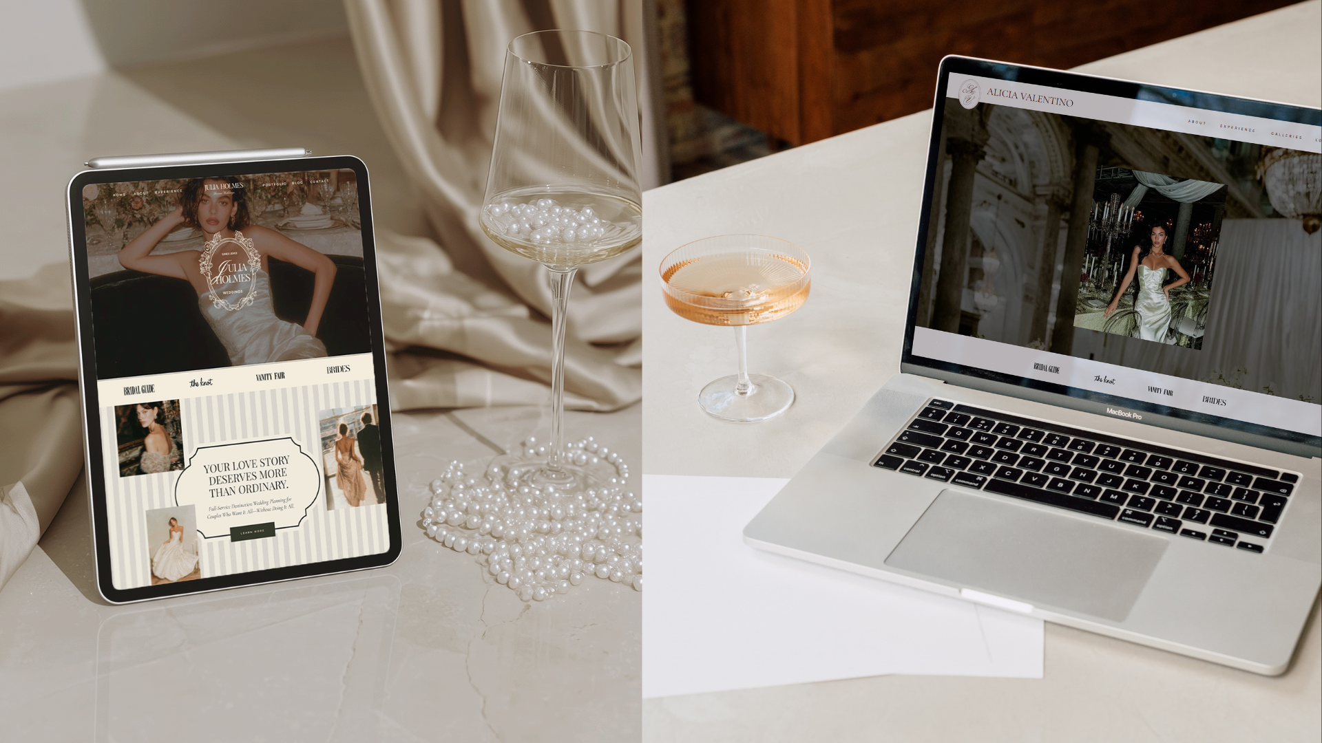
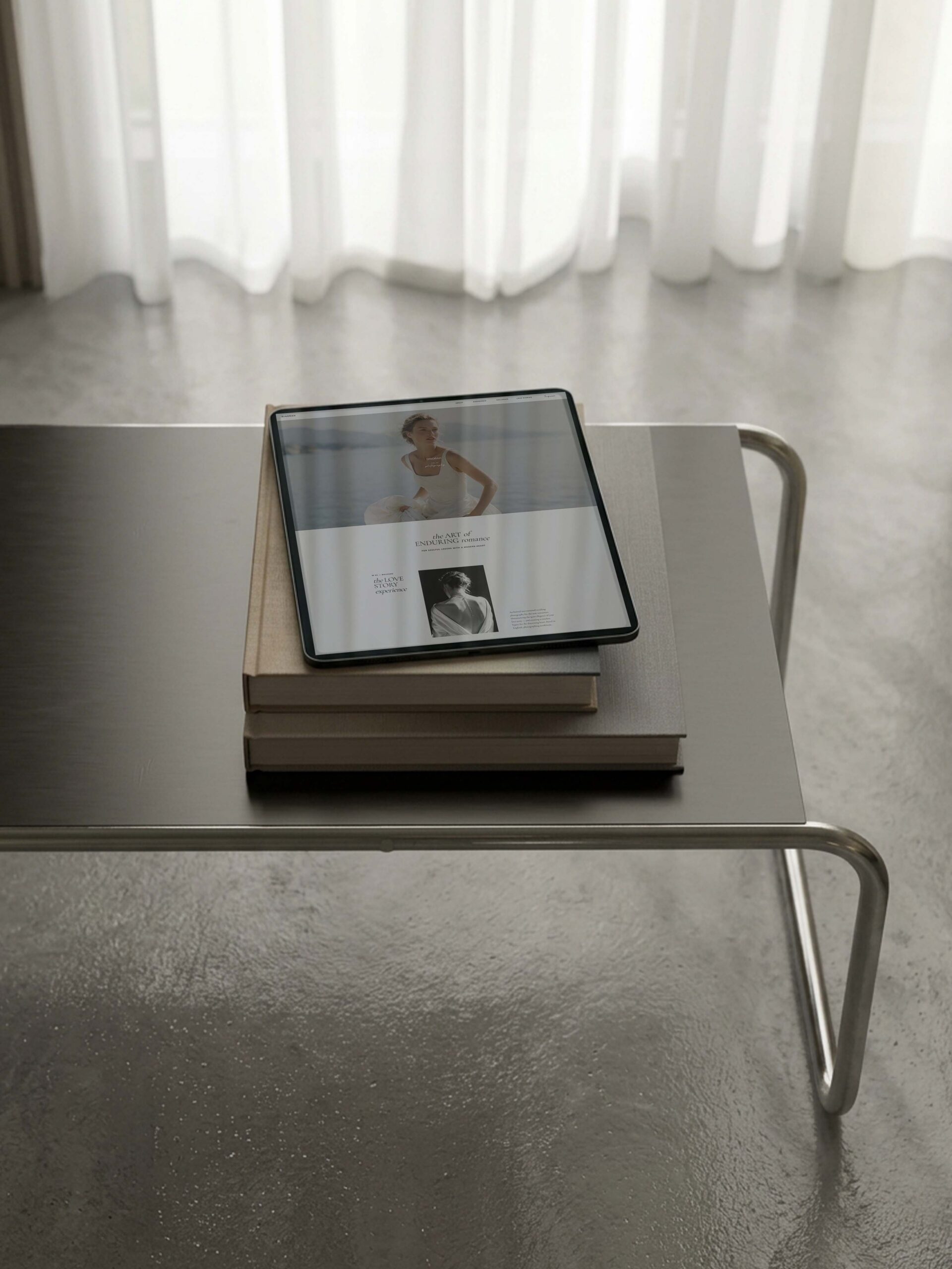
Romantic editorial wedding planner website template. Julia and Alicia Showit templates by The Closers Society.
The Website Mistakes That Quietly Work Against Wedding Planners
Most wedding planner websites are not dramatically broken. They are simply answering the wrong questions in the wrong order.
Leading with services before establishing trust
A bride already understands, generally, that planners offer planning services. She does not need “Full Planning, Partial Planning, and Coordination” to be the first meaningful thing she learns about you.
She needs to know whether your work feels relevant to her celebration and whether your approach feels safe enough to explore.
Services matter, but they make more sense after the website has created recognition. Otherwise, the visitor is comparing packages before she has developed a preference for the person behind them.
Treating the gallery like a storage unit
A wedding planner’s gallery should show range, atmosphere, and creative direction. It should not include every photograph simply because every photograph is beautiful.
When thirty images appear in quick succession, the visitor stops noticing the individual decisions that made each wedding distinct. The work begins to blur together, which is unfortunate because “beautiful but difficult to remember” is not usually the positioning anyone intended.
Choose photographs that show different parts of your value: the overall setting, guest experience, tablescape, ceremony design, intimate details, and the moments that reveal how the day felt.
Curation communicates confidence.
Hiding the planning process
A bride comparing planners is often trying to understand what will happen after she books. If the website jumps from services to contact without showing how the relationship works, she is left with a beautiful result and no sense of the journey required to reach it.
Your process does not need to include every meeting or document. It should simply answer the larger emotional question: “Will I know what is happening, and will someone capable be guiding me?”
Giving no investment signal
You do not need to publish a complete pricing guide on the homepage. You do need to give enough context for the right client to recognize herself.
A starting investment, planning minimum, or specific positioning statement can prevent every inquiry from beginning with a budget surprise. Without any signal, the bride is forced to inquire simply to discover whether the conversation makes sense.
That creates more inquiries on paper, but not necessarily more of the inquiries you want.
What a Converting Wedding Planner Website Does Instead
A converting website does not pressure a bride into contacting you. It gives her enough clarity and confidence that contacting you feels like the sensible next step.
It begins with recognition. The opening should help her see the kind of celebration you create, the kind of client you serve, or the kind of planning experience you provide.
It then gives the work room to speak. Not all at once, and not through a gallery that feels as though it is trying to win an argument. The imagery should be placed intentionally enough for her to notice your taste rather than merely register that weddings occurred.
Next, the site explains the experience. It shows how you guide, what you manage, and what makes your approach different. This is where your process, philosophy, and proof turn visual interest into trust.
Then it presents the services with enough information to establish fit. By this point, the visitor understands not only what you offer, but why she may want you specifically.
Finally, it gives her one clear door.
“Inquire,” “Begin Your Planning Experience,” or “Tell Us About Your Wedding” can all work. What matters is consistency. A homepage with several equally important actions creates the feeling of choice while quietly increasing hesitation.
The strongest path is usually one primary action repeated at the moments when a bride has enough information to take it.
Julia or Alicia: Which Wedding Planner Website Template Fits Your Brand?
Julia and Alicia were both designed as Showit templates for wedding planners, so the difference is not that one contains the “correct” sections and the other does not. Both provide room for imagery, process, proof, services, and a clear inquiry path.
The real difference is the first emotional impression.
Choose Julia for romantic warmth
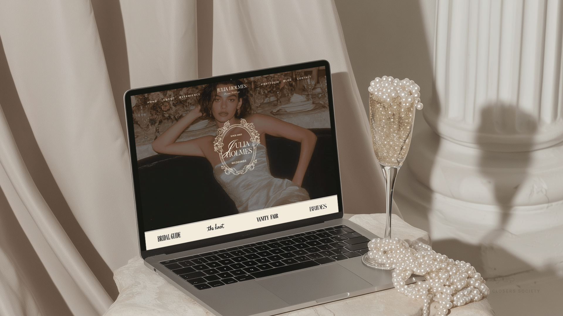
Julia is designed for planners whose work feels personal, graceful, warm, and softly refined.
It is well suited to garden weddings, estate celebrations, intimate destination events, romantic tablescapes, layered florals, and portfolios with an emotional softness running through them.
A bride landing on Julia should feel welcomed into the experience. The design supports warmth without making the business look informal and romance without becoming overly ornamental.
Julia may fit your brand when clients describe your work as:
- Romantic
- Timeless
- Intimate
- Graceful
- Thoughtful
- Warm
The design feels considered, but it does not keep the visitor at a distance.
Choose Alicia for quiet luxury
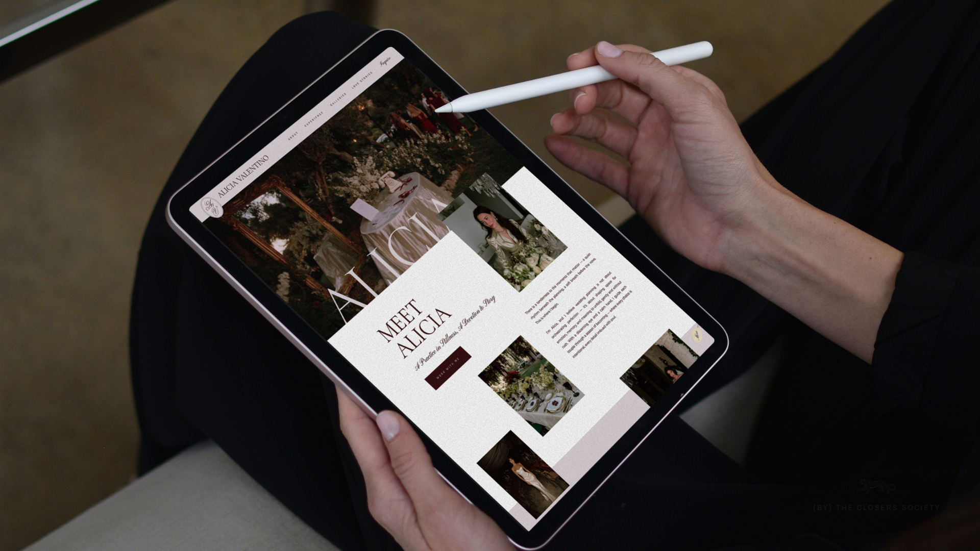
Alicia is designed for planners whose work feels modern, restrained, architectural, or fashion-led.
It gives more visual authority to negative space, stronger typography, and a quieter page rhythm. It works especially well for portfolios featuring destination celebrations, modern venues, editorial fashion, sculptural florals, and elevated neutral palettes.
A bride landing on Alicia should feel that the standard is already established. The design does not need to explain its confidence at length.
Alicia may fit your brand when clients describe your work as:
- Modern
- Refined
- Intentional
- Sophisticated
- Fashion-forward
- Understated
Julia leads with warmth.
Alicia leads with composure.
Both can support a luxury wedding planner website. They simply express luxury differently.
🍓 Click to See JULIA Live Site
🍓 Click to See ALICIA Live Site
A Beautiful Template Still Needs to Reach the Launch
Choosing between Julia and Alicia is the enjoyable part. Then comes the work of replacing the images, preparing the copy, customizing the colors, checking the mobile design, connecting the domain, and publishing the website.
This is where many templates quietly become very stylish unfinished projects.
The Showit templates from The Closers Society are built as part of The Closers Launch Method because the goal is not to help you purchase a beautiful design. The goal is to help you turn it into a website you can confidently send to a bride.
Each template includes:
The Design
The editorial Showit foundation, with the page structure and visual hierarchy already considered.
The Closers Resources Vault
Tutorials that guide you through the technical and creative parts of customization.
The Brand Kit
Canva-based brand assets that help the website feel connected rather than assembled from several Sunday-afternoon decisions.

The Closers Resources Vault – Tutorial Video Library
The Closers Launch Suite
Preparation tools, visual guidance, checklists, and launch support that help move the project from your account into the world.
The value is not simply that the template looks beautiful on the day you buy it.
It is that the structure, tools, and guidance help your own work look beautiful when the website becomes yours.
Frequently Asked Questions
What is the best wedding planner website template?
The best wedding planner website template is one that supports how couples choose a planner. It should show strong imagery, explain the planning experience, establish proof, clarify the services, and lead visitors toward one clear inquiry action.
Is Showit a good website platform for wedding planners?
Showit is a strong option for wedding planners who want control over imagery, typography, page layout, and mobile design. Its flexibility works particularly well for editorial websites, but the template still needs a clear strategic structure so the site does more than display attractive photographs.
Should I choose Julia or Alicia?
Choose Julia when your brand should feel romantic, warm, graceful, and personal. Choose Alicia when your brand should feel modern, restrained, confident, and quietly luxurious. The best choice is the one that reflects the weddings you want more of and the way your clients describe them.
Should a wedding planner website include pricing?
You do not need to publish every package price, but you should provide some indication of investment level. A starting figure, minimum, or clear positioning statement helps reduce budget-mismatched inquiries and allows the first conversation to focus more on fit.
Is a template enough for a luxury wedding planner?
A niche-specific template can be enough when your services, audience, messaging, and portfolio are already established. Custom design becomes more useful when your business needs a highly specific client journey, unusual functionality, or a website built around positioning that cannot comfortably fit an existing structure.
Choose the Template That Feels Like Your Weddings
A bride should not have to study your website carefully to understand whether your work belongs in the world she is imagining.
She should feel it in the pacing, the photographs, the typography, and the quiet confidence of a page that knows what matters first.
Julia and Alicia were designed to create that recognition in two different ways: Julia through romantic warmth and Alicia through deliberate restraint. Both give your weddings room to breathe, your process room to reassure, and your prospective client a clear reason to keep moving toward you.
 SAVE THIS POST FOR LATER




share this post