


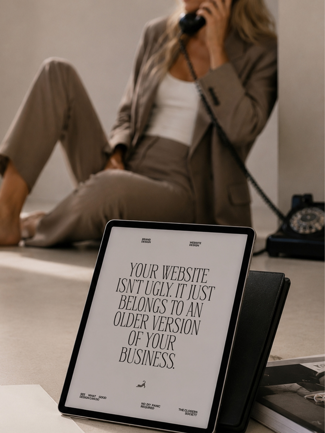
Your website does not have to be bad to be wrong for the business you have now.
The awkward part: nothing is technically wrong
The most dangerous website is not always the ugly one. Ugly gets dealt with. The sneaky one is the perfectly decent website that still works, still loads, still has your services, and quietly introduces a version of your business you stopped being two years ago.
Maybe you built it when you were taking every inquiry. Now you are selective. Maybe your portfolio used to be “whatever I can show.” Now there is a point of view. Maybe the price went up, the work got better, the referrals got warmer, and the website simply kept wearing the same outfit to every room.
That is why the discomfort can be hard to name. You are not looking at a broken website. You are looking at a lag.
The symptoms are usually tiny
You hesitate for half a second before sending the link. You would rather someone find your Instagram first. You keep changing the homepage headline. You buy another font. You reorder the portfolio. You tell yourself a fresh photo shoot will fix it.
Sometimes those tweaks help. But when the core problem is perception, rearranging the furniture does not change the address.
The question I ask is not “Do you like your website?” It is: if someone knew nothing about you and landed here today, what level of business would they assume they just found? That answer is far more useful.
A redesign is not punishment for a bad website
There is a weird internet narrative that you earn a redesign only after your current site becomes embarrassing enough. I do not buy that. Some of the best redesigns begin when the business is doing well.
You have proof. You know what clients value. Your offer is clearer. Your taste is sharper. You are no longer designing for a hypothetical future business. You finally have enough information to build around the real one.
That is a much better reason to redesign than “I am sick of this font.”
What should change when the business changes?
Not necessarily everything. Good custom design is not a demolition hobby. I look for the places where perception is lagging: the hierarchy, the photography, the language, the way services are framed, the amount of explanation, the pace of the page, the confidence of the calls to action.
An established business usually needs less proving and more editing. Better work gets more room. Stronger claims need fewer exclamation points. The visitor should understand the standard without being chased through the site by seventeen buttons.
The goal is not “make it look expensive.” The goal is to make the business feel accurate.

The test I would use today
Open your homepage on your phone and pretend the business belongs to someone you have never met. Do not read every word. Look for ten seconds.
What do you assume about the price point? The type of client? The quality of the experience? Is the work obvious? Is the personality specific? Does the site feel current to the business, or merely current enough to the internet?
If the answer makes you twitch a little, excellent. That is information, not a crisis.
When the lag becomes the strategy problem
The Closers Atelier is for that exact season: when a prettier version of the old site is not enough, because the business itself needs to be translated differently. Custom brand and Showit website design, built around the perception the business needs now.
 Explore custom design with The Closers Atelier
 SAVE THIS POST FOR LATER






share this post