")


")
")


Let’s dispense with the pleasantries and get to the heart of the matter.
You are good at what you do. Maybe even the best. But when you send a potential client your website link, do you hold your breath a little? Do you hit “send” and secretly hope they don’t look too closely at the mobile version?
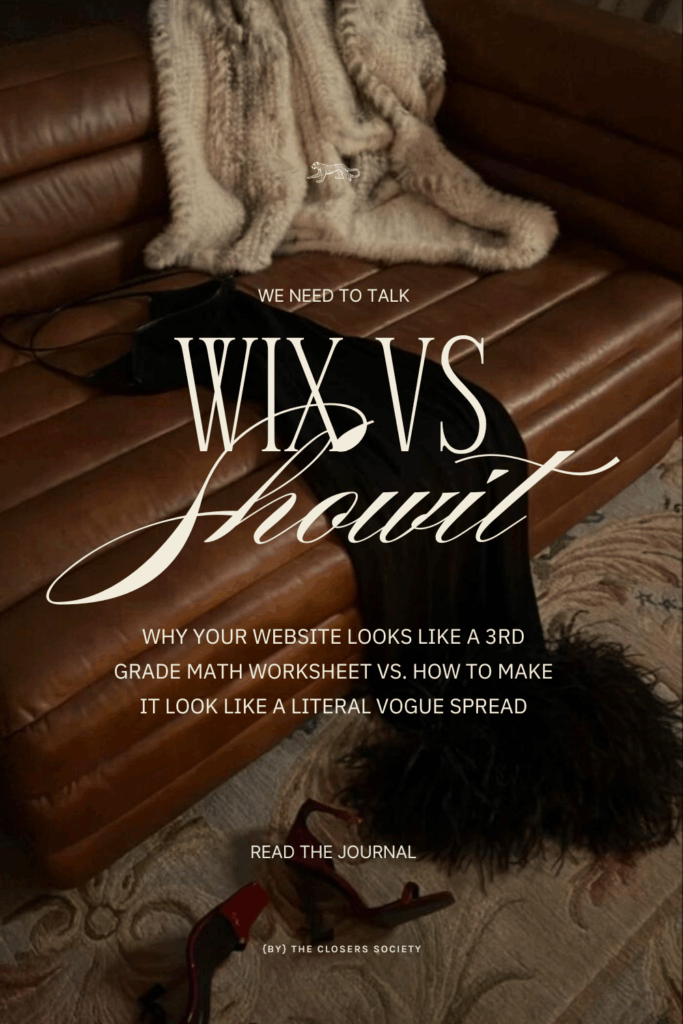
If your website feels less like a Vogue spread and more like a 3rd-grade math worksheet, we need to talk.
There is a distinct difference between having a website and building a brand. Wix is a website builder. It is functional, sensible, and safe. It’s the Honda Civic of the internet. Showit is a brand architect. It is precise, fluid, and designed for those who understand that in this industry, perception is the only currency that matters.
If you are a photographer, planner, or coach still operating on a template that restricts your movement, you aren’t just frustrating yourself—you are signaling to your potential clients that you are “entry-level.”
And at The Closers Society, we don’t do entry-level.
Here is the brutally honest breakdown of Showit vs. Wix, and why the switch isn’t just a technical upgrade—it’s the necessary evolution for your business.
1. Design Freedom: The “Strip” vs. The Canvas
To understand why your Wix site feels “off,” you have to understand how it was built.
Wix uses a block-based editor. It is designed to prevent you from making mistakes by forcing you into rows, columns, and strips. It is essentially “paint-by-numbers.”
-
Want to move that photo two inches to the left? You can’t. The grid won’t let you.
-
Want to layer your logo behind a header? Good luck. The block structure says no.
It’s safe? Yes. Inspiring? Hardly.
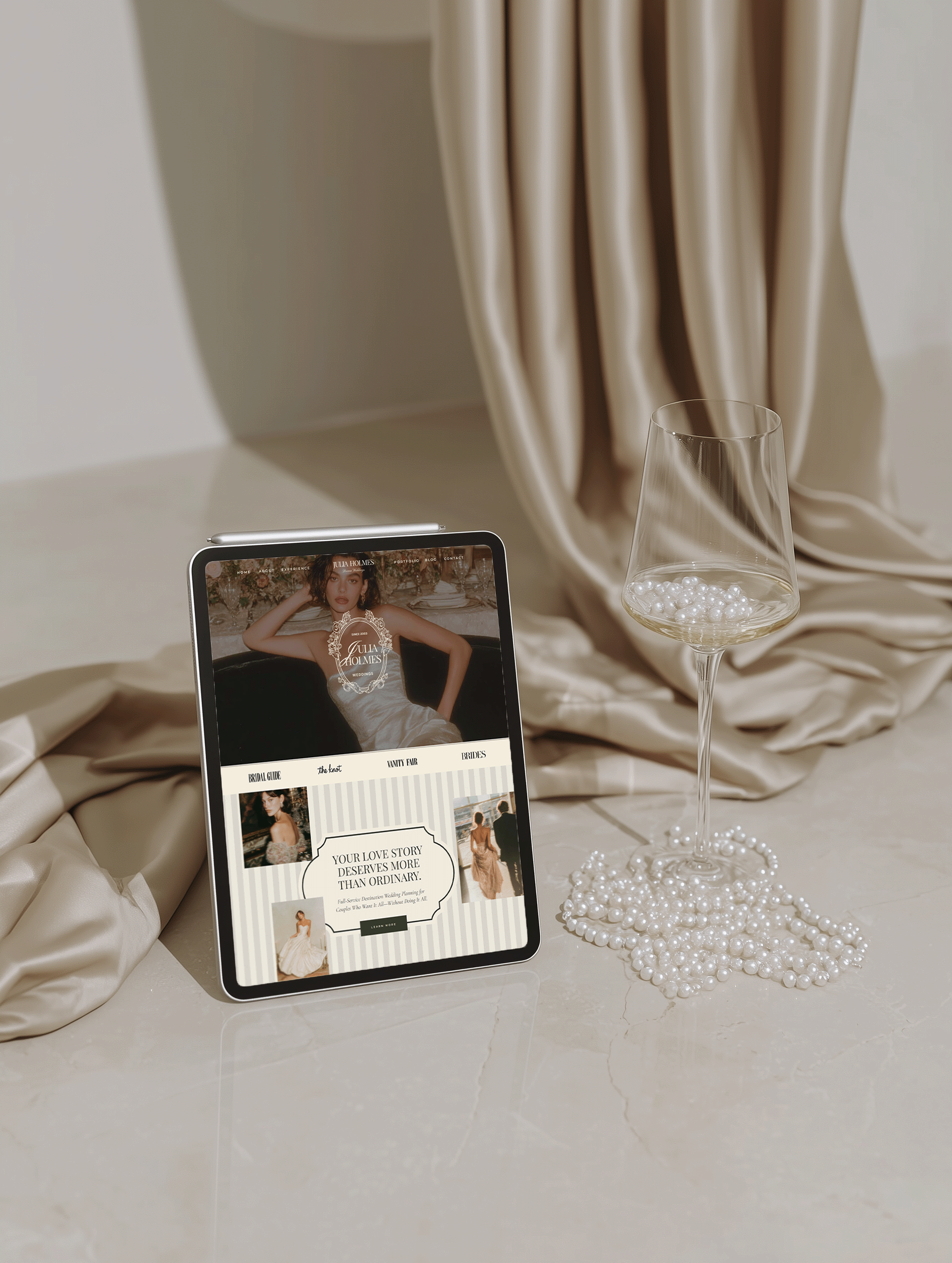
Showit operates on a true drag-and-drop interface. It assumes you are intelligent enough to handle a blank canvas. It doesn’t use grids. It allows you to place a headline exactly where it creates the most visual tension. It allows you to layer images, rotate text, and break the rules of “standard” web design.
Think of it this way: Wix is purchasing a suit off the rack at a department store. Showit is having one bespoke tailored on Savile Row. Both cover the body. Only one commands the room.
2. Mobile Responsiveness: Automated vs. Curated
In 2026, a “responsive” site that simply stacks your desktop content into a single, cluttered column is unacceptable.
Wix attempts to automate the mobile experience. It guesses how your site should look on a phone. The result is often inelegant—text floats in voids, buttons are misaligned, and images are cropped awkwardly. You end up spending hours fighting the auto-formatter just to make it look presentable.
Showit hands you the controls for a custom mobile design. You curate the mobile experience independently from the desktop version.
-
Is that gallery too long for a phone screen? Hide it on mobile only.
-
Is the font too small for a thumb-scroll? Resize it instantly.
You decide the journey your client’s thumb takes. You create an app-like experience that feels intentional, not accidental. It’s not “more work”—it’s control.
3. SEO Capabilities: The “Beauty & Brains” Power Couple
I often hear the objection: “I’m staying with Wix because I’m worried about SEO.”
Let’s correct this myth immediately. Showit is arguably superior for SEO.
Wix keeps everything in a closed ecosystem. Showit, however, pulls a genius move. It pairs its design interface with WordPress for blogging.
-
The Face: You get the drag-and-drop ease of Showit for your pages (no code required).
-
The Brains: You get the indexing power of WordPress—the platform that powers 43% of the web—for your content.
You get the aesthetic freedom of a designer with the ranking dominance of the world’s most powerful search engine. It is the marriage of beauty and brains.
4. The Verdict: Who is Showit For?
If you are content with “good enough,” remain with Wix. It serves a purpose for generalists, and there is no shame in that.
But you should switch to Showit if:
-
You are a Photographer who needs high-resolution galleries that don’t slow down load times.
-
You are a Coach who needs a personal brand that feels human, not corporate.
-
You are a Creative Leader ready to set the market standard rather than follow it.
Your Brand Deserves a Platform That Can Keep Up
You have the vision. You have the talent. You just need the digital home that reflects it.
And the best part? You don’t have to start from a blank screen to get that custom look.
I’ve curated a collection of strategic designs specifically for ambitious creatives who are ready to skip the “struggle phase” and go straight to the “sold out” phase.
[Browse The Design Collection]
📌 PIN IT | SAVE FOR LATER


share this post